Alerts
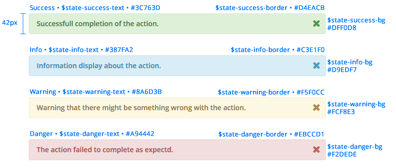
Alerts are used to tell users when actions are incomplete, or rejected. Alerts should be placed at the top of the display view to have an importance in hierarchy. Alerts are represented in "Success", "Info", "Warning" and "Danger" (Error) states with their corresponding colors below.
.alert {
    font-weight: 600;
    min-height: 40px;
}

.alert .close {
    font-size: 20px;
}

/* $state-success-text - $state-success-bg - $state-success-border */
.alert.success {
    background: #dff0d8 none repeat scroll 0 0;
    border: 1px solid #d4eacb;
}

.alert.success p {
  color: #3c763d;
}

/* $state-info-text - $state-info-bg - $state-info-border */
.alert.info {
    background: #d9edf7 none repeat scroll 0 0;
    border: 1px solid #c3e1f0;
}

.alert.info p {
  color: #387fa2;
}

/* $state-warning-text - $state-warning-bg - $state-warning-border */
.alert.warning {
    background: #fcf8e3 none repeat scroll 0 0;
    border: 1px solid #f5f0cc;
}

.alert.warning p {
  color: #8a6d3b;
}

/* $state-danger-text - $state-danger-bg - $state-danger-border */
.alert.danger {
    background: #f2dede none repeat scroll 0 0;
    border: 1px solid #ebd1d1;
}

.alert.danger p {
  color: #a94442;
}
Indicators
Indicator lights should be visible to represent the health of an action or system.
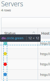
Active - Green: #37c180 $green
Suspended - Yellow: #e4d12e $yellow
Error - Red: #fa1919 $red
Running - Blue: #378dd4 $blue